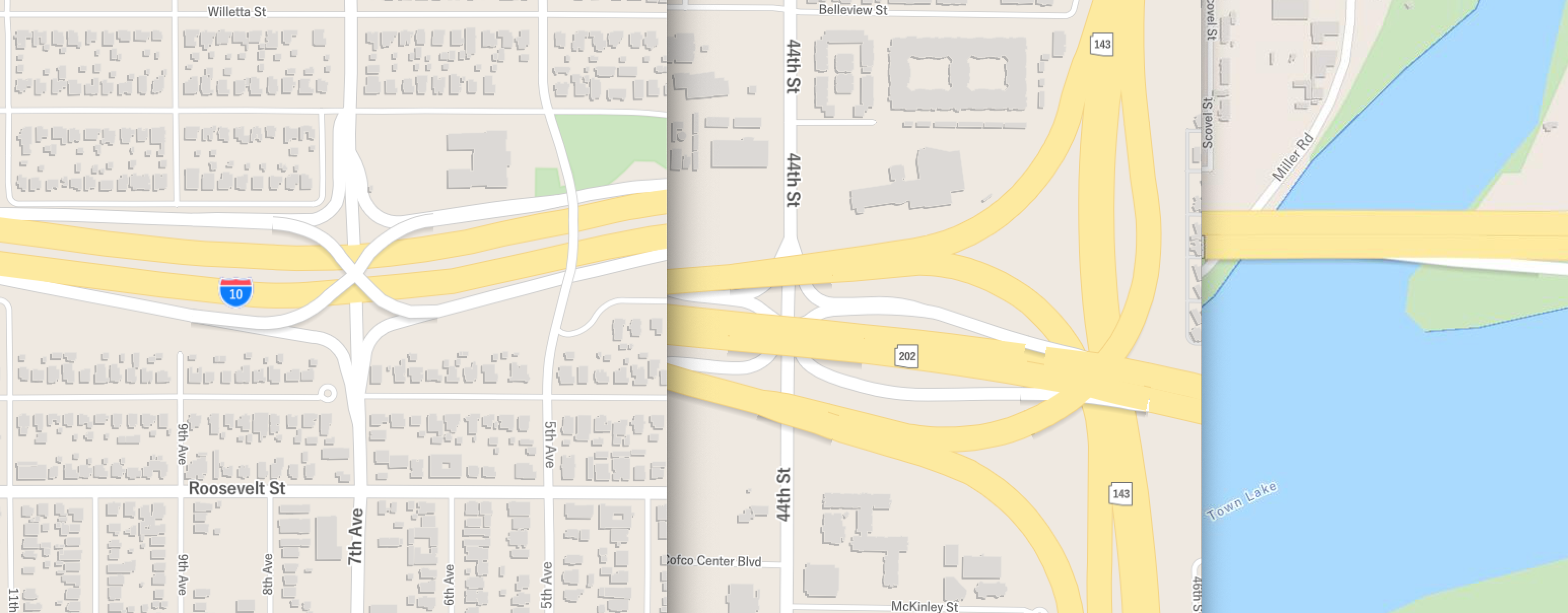
Continuing on with cartography in vector tiles, I’ve recently been experimenting with adding shadows to bridges and overpasses. Using shadows is not a new concept, they can provide some nice “personal touch” style detail and give the user a sense of visual depth. Typically in a vector basemap, shadows are used on building or water polygons with the paint property fill-translate like:"fill-translate": {
"base": 1,
"stops": [
[ 13, [ -0.5, 0.5 ] ],
[ 14, [ -1.5, 1.5 ] ],
[ 16, [ -2, 2 ] ] ]
}
My first attempt at using this technique on bridges and overpasses turned out pretty good but required some additional settings. Once the translate property was given, as line-translate, the effect needed to be ordered correctly in the map - sandwiched between below the bridge group but above the roads group. Then the sharp edges of the line needed to be dulled a bit, I used a combination of line-blur and line-opacity."paint": {
"line-opacity": 0.2,
"line-color": "#000",
"line-width": {
"base": 1,
"stops": [
[ 8, 3 ],
[ 18, 32 ]
]
},
"line-blur": 5,
"line-translate-anchor": "map",
"line-translate": {
"base": 1,
"stops": [
[ 13, [ -1, 1 ] ],
[ 15, [ -3, 3 ] ]
]
}
}
The end result is pretty great, but upon further inspection of more complex intersections the effect did not look as great. The direction of the line made some of them look weird, also major interchanges had several levels of overpasses and bridges that just appeared to float above the roads.

Shadows on bridges using translate High-Res Version
My next step was to add a LEVEL attribute to the centerline data - all bridges got an automatic 1, then I added 2’s and 3’s and so forth. After updating the vector tile package, I added some new layers to the style. Here’s the order of layers for my map (from bottom to top):
- Tunnel Case
- Tunnel
- Road Case
- Road
- Bridge Shadow
- Bridge Case
- Bridge
- Bridge Level 2 Shadow
- Bridge Level 2 Case
- Bridge Level 2
- Bridge Level 3 Shadow
- Bridge Level 3 Case
- Bridge Level 3
Then for styling I toyed with various riffs on translate but ended up with just making the shadows a wider line that was blurred. My shadow layers now look like this:"paint": {
"line-opacity": 0.15,
"line-color": "#000",
"line-width": {
"base": 1,
"stops": [
[ 8, 6 ],
[ 18, 46 ]
]
},
"line-blur": 8
}
My line-width is double what the case layer width is, there’s more opacity, and a higher blur factor.

Shadows on bridges using width and blur High-Res Version
The combination of bridge stacking and shadows make the intersections look pretty awesome! A further addition I’d recommend is using line-gap-width for the road casing so that individual lines would be seen instead of merging together.
Got questions or comments? Feel free to email me or hit me up on twitter.