.
tl;dr - here’s this animation map!
Some people watch American Idol, or the Bachelor, or Soccer - I watch professional wrestling. It was one of the best things about Saturday mornings growing up, tuning into TBS to see the latest stories unfold. And since college, I’ve had a pretty solid group of friends who regularly convene to watch, mostly as a means to hangout and eat pizza. Wrestling shows, like most sports, thrive off of a live audience. But with wrestling there is no home or away team to travel to, so they regularly travel the world to bring the show to where the fans are.
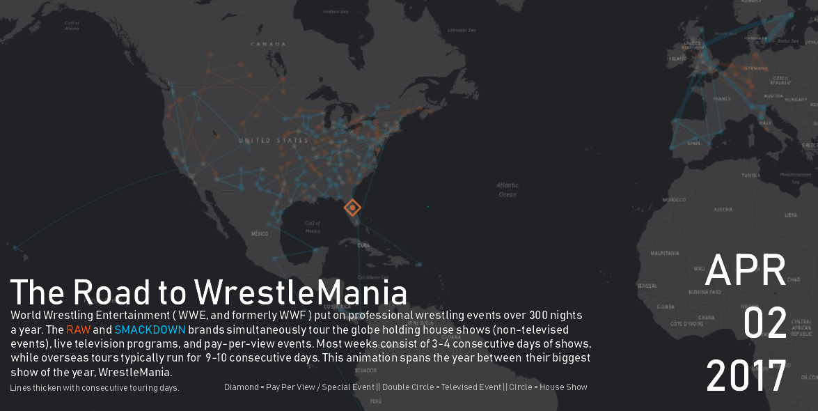
The largest wrestling promotion (sports entertainment company) in the world is the WWE (World Wrestling Entertainment), formerly known as the WWF (World Wrestling Federation). They travel the globe over 300 nights a year putting on live shows, sometimes in two different places at the same time. These shows fall into 3 main categories: house shows (non-televised live events), televised shows (broadcast live weekly), and pay-per-views (live monthly events for an extra cost). The WWE’s two main programs are Monday Night RAW, and Smackdown Live - called “brands”, they represent two separate touring groups. The televised shows present the main plot points on a weekly basis, the house shows continue the story throughout the week, and the pay-per-view events present the culmination or continuation of the story on a monthly basis.
The largest event of the year is WrestleMania. Getting to perform at this show signifies that you’ve “made it” as a wrestler, and being the in the Main Event at WrestleMania is probably the biggest career achievement one can dream of. Business wise, WrestleMania generates about 150 million in economic impact to it’s host city, including setting stadium attendance records and fans traveling to the event from just about every country in the world.
So, what’s this all look like on a map? Lots of locations, time aware, tied together by weekly tours through a region. I first decided to cap the time frame to the year in between their largest show, WrestleMania. Logically, the Road to WrestleMania starts the night after WrestleMania. To get the dates and locations of all shows, I scraped the live events page of the WWE website, which included a bit of cleaning up and formatting to get a legible table. Next, I used the MMQGIS Plugin to geocode my csv of locations (City, State, Country).
To get mapping, I decided to use ArcGIS Pro - I had just finished the #cartomooc chapter on animation, and wanted to try it out. With points in, I symbolized them by the show type to display a visual hierarchy across locations. I ran a few test animations after setting up the time aware component and just seeing the points flash was cool, but didn’t do much for me. It made sense to connect the points with lines since they actually do weekly tour stints. I connected consecutive days of shows with lines, attaching the “to” date and a counter to each line allowing me to animate the lines as well. Straight lines are boring - using the Geodetic Densify tool in ArcGIS Pro, I was able to add geodesic curves to give the appearance of traveling across the globe - which looks awesome on long lines. To finish the lines, I used a graduated symbol style by the count of consecutive days attribute I added - this made the lines appear thicker the longer the tour went on. This animation was starting to come together.
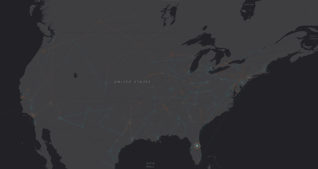
I began annotating the animation using the text tools in ArcGIS Pro, making use of the formatting and dynamic tags to stylize the text beyond the basics. I still thought the animation was missing something. I began tinkering with trying to show a trailing off effect. Using the time offset feature in the time section of the layer properties, I created a copy of all my layers and applied a 1 day offset with 75% transparency. This would show the points and lines for a brief moment in muted color as the day passed. Yes! I also threw in copies of all features with simpler symbology at 90% transparency to just barely show the vast touring network and give a visual cue to the viewer of where the animation would be happening. After tinkering with rendering options I had a great looking export.
The final version is sped up a tad - the original version runs for about a minute. Please feel free to email me or hit me up on twitter if you want some more details or have any general questions.